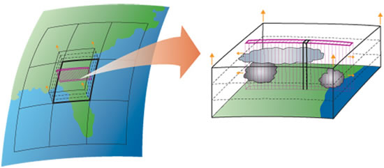
When I explain the concept of a multiscale modelling framework (MMF), or super-parameterization, I often find it helpful to show a picture of what it “looks like”. There’s a few classic images for this that I’ve used for years. Here’s one of the original images commissioned by CMMAP:
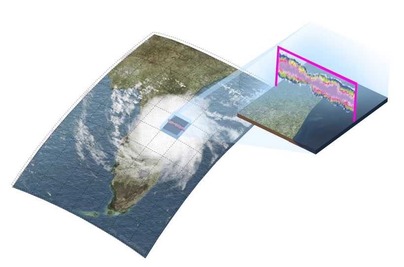
And here’s a more recent one commissioned by the Exascale Computing Project to develop E3SM-MMF:
And now I have this fancy one that I made with ACTUAL data from a E3SM-MMF run:
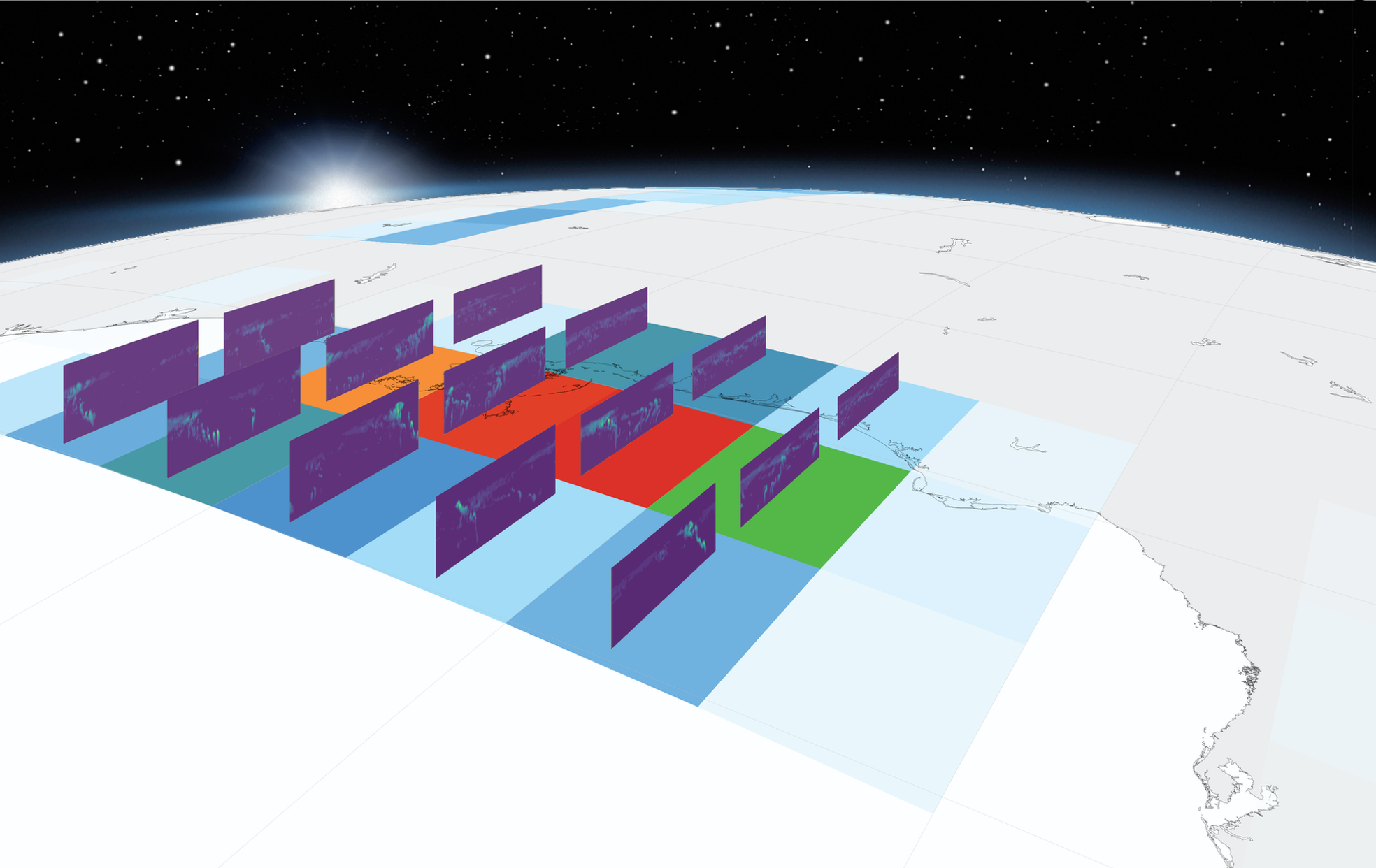
This is an instantaneous output from a run where I made the CRMs a bit higher resolution than normal to make it look nicer. The surface shading is the precipitation rate, and the shading within each CRM is using the cloud liquid and ice tracers.
I’m a bit embarrassed to share the code that I used to make this… it’s very convoluted… but I’m happy to share if somebody actually wants it.
Also, feel free to use any of these images for… whatever.