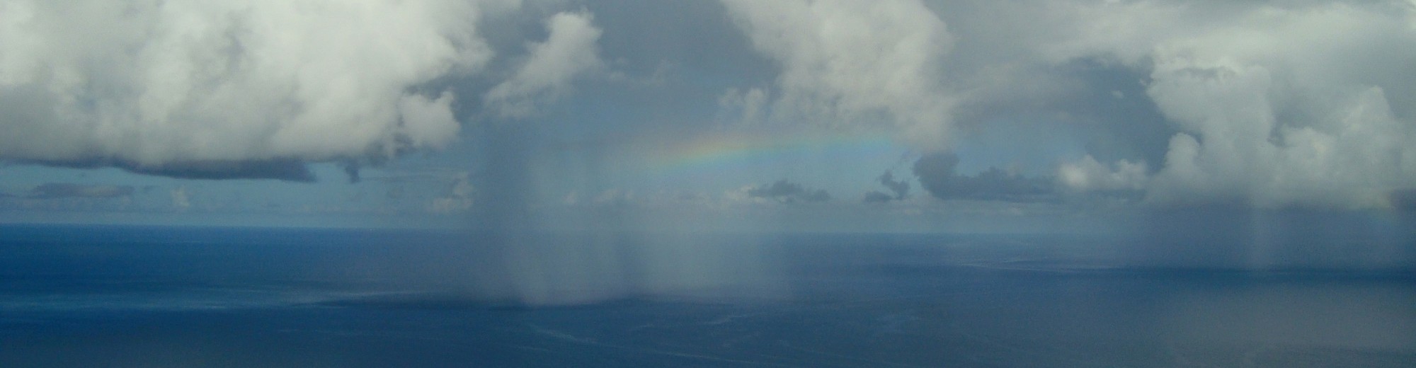
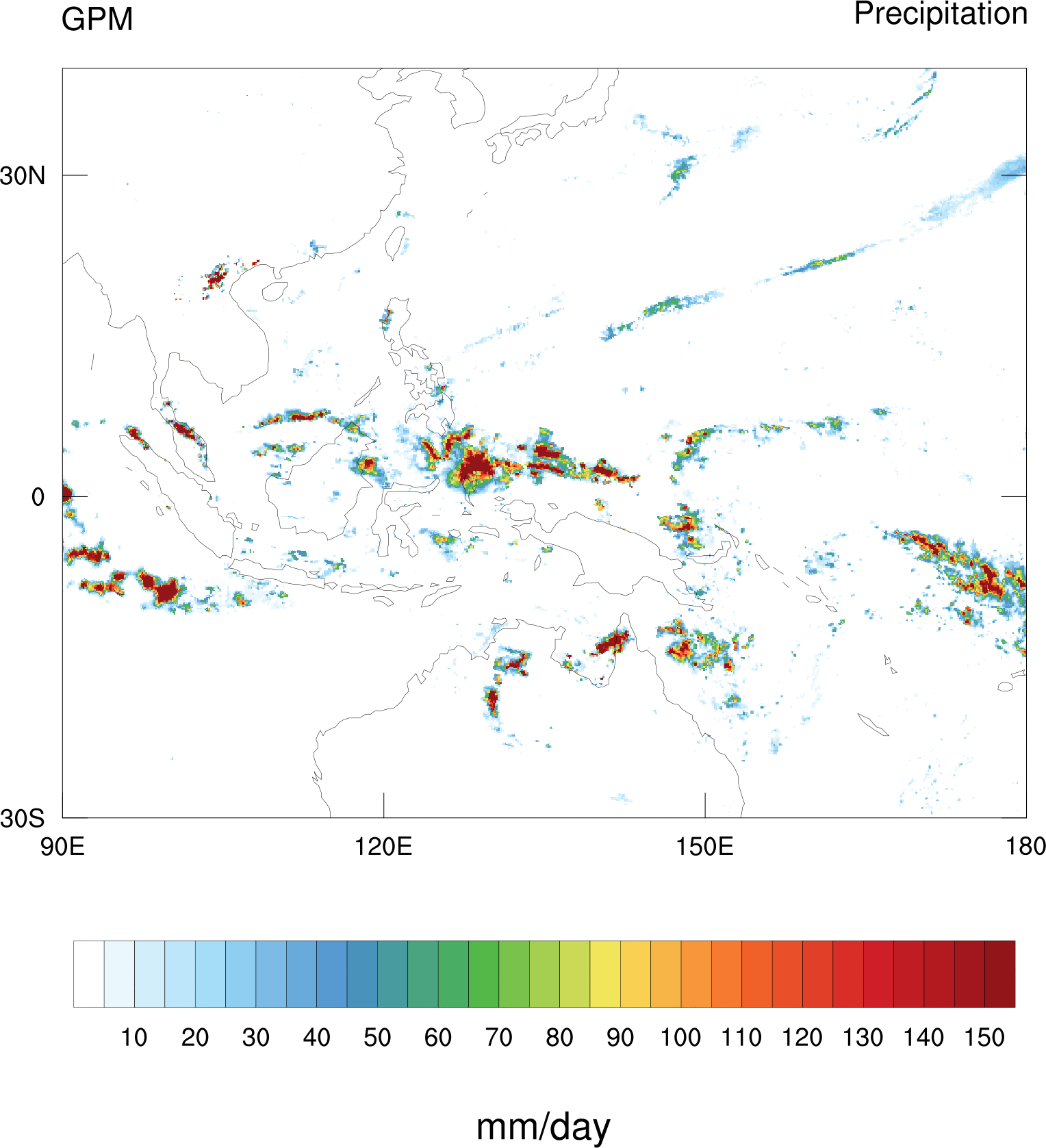
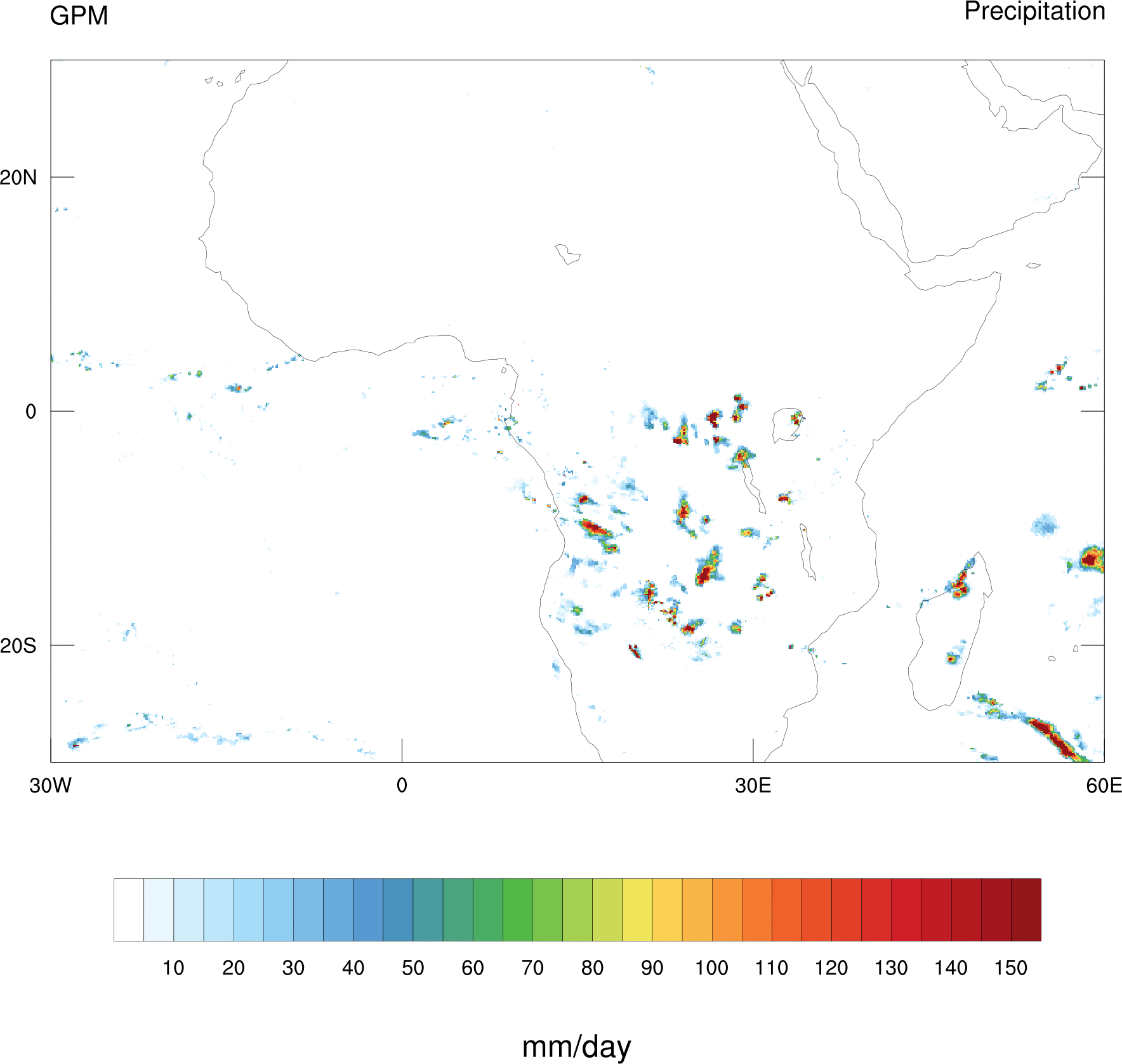
I recently realized that the data from the relatively new Global Precipitation Measurement (GPM) satellite can show incredibly fine detail! The spatial resolution is 0.1×0.1 degrees and its available at a 30 minute temporal resolution! This is particularly exciting because lately I’ve been doing some very fine grained analysis of a model with a 30 minute timestep, so this allows a very direct comparison between the “real-time” weather in observations and a model. Today I made some animations of GPM data and just wanted to share. The animations below are from January 1, 2017. This choice was arbitrary, there’s nothing special about this date that I chose. Note that the swath of the GPM data can’t cover the whole globe every 30 minutes, so the swath data is blended with other satellite data to make the IMERG data that was used here (The specific IMERG variable here is “precipitationCal”). This sometimes results in some funny looking artifacts or clouds that don’t seem to move in a natural way.
Thank you for sharing this fascinating article! It’s truly amazing to see the incredible detail that the Global Precipitation Measurement satellite can capture. The ability to compare real-time weather observations with your model on such a fine scale is a remarkable opportunity for improving our understanding of weather dynamics. The animations from January 1, 2017, provide a captivating visual insight into the intricacies of precipitation. Your explanation about the data blending process and the potential for artifacts adds an extra layer of appreciation for the complexity of these analyses. Looking forward to more insights and animations!