
Below are a few figures for monitoring the current state of the El Niño / Southern Oscillation (ENSO).
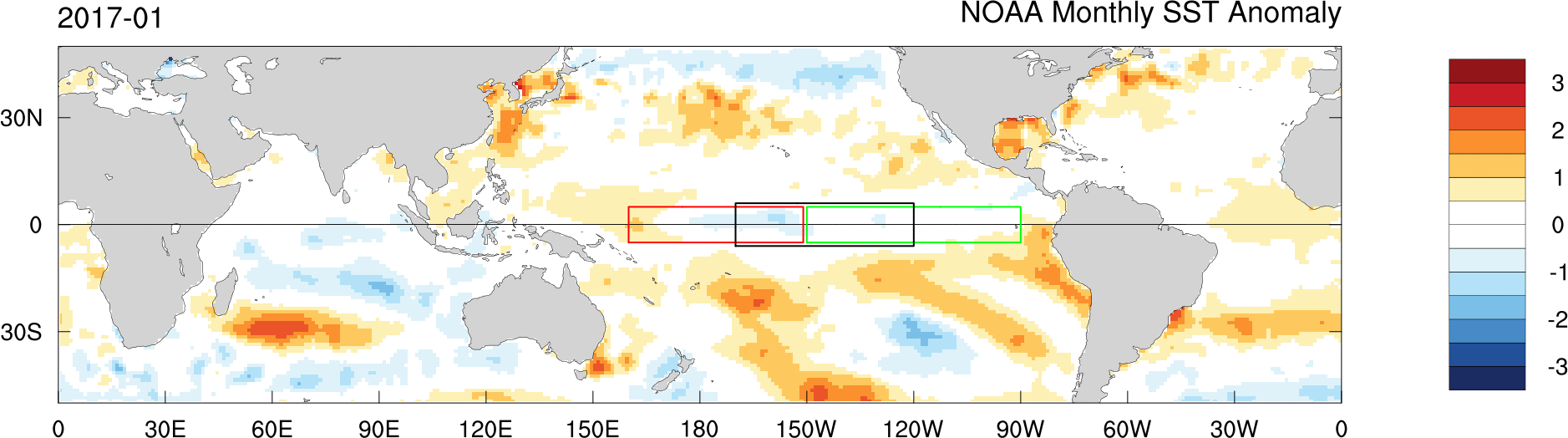
Animation of recent SST Anomalies using NOAA monthly mean interpolated sea surface temperature (SST) data.
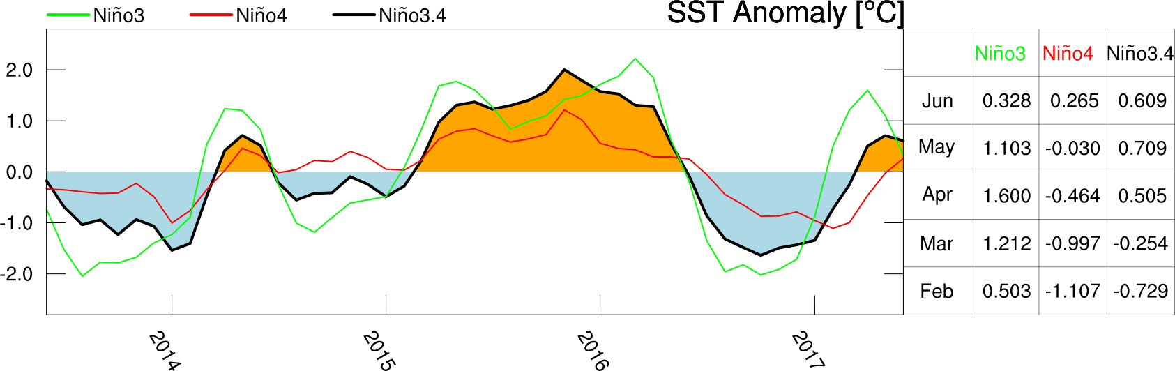
Time series of monthly NOAA sea surface temperature (SST) anomalies over the three main ENSO index regions indicated in the animation above for the most recent 20 years (left), and table of values for the most recent five months (right).
ENSO Forecast
The figure below shows current model forecasts of SST anomalies in the ENSO3.4 region. Data was obtained from the International Research Institute (IRI) for Climate and Society at Columbia University. The plot below is similar to the plot that IRI produces, but I wanted to simplify it a bit.
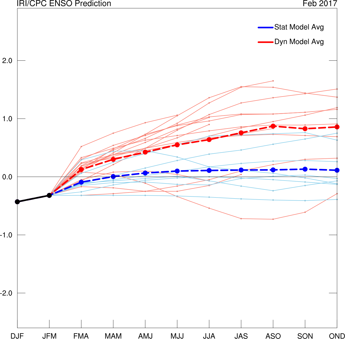
Time series of ENSO forecasts from dynamical (red) and statistical (blue) models. Observations are shown in black.