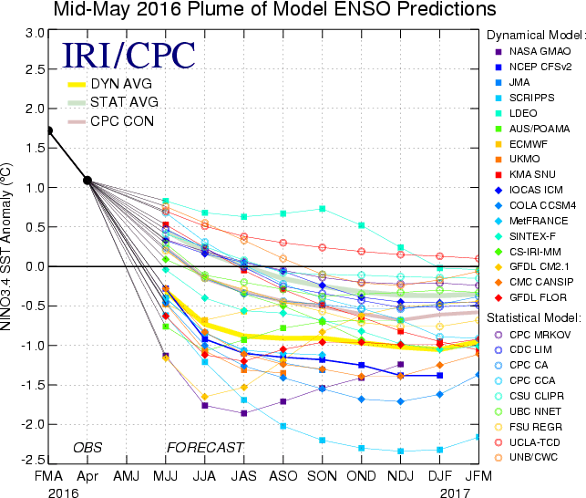
There’s a nice figure of model forecasts produced by the International Research Institute (IRI) for Climate and Society at Columbia University (see below). It’s a nice plot, but it’s hard to see the ensemble averages, which is what I’m most interested in looking at.
Since the forecast data is freely available, I decided to remake the IRI plot on my ENSO page, and make it so the ensemble averages stand out. I hardly ever care about which model did the best. I usually just want to see the ensemble average, and also see the spread of the ensemble to see if there are any outliers or if there is a lot of agreement between the forecasts.
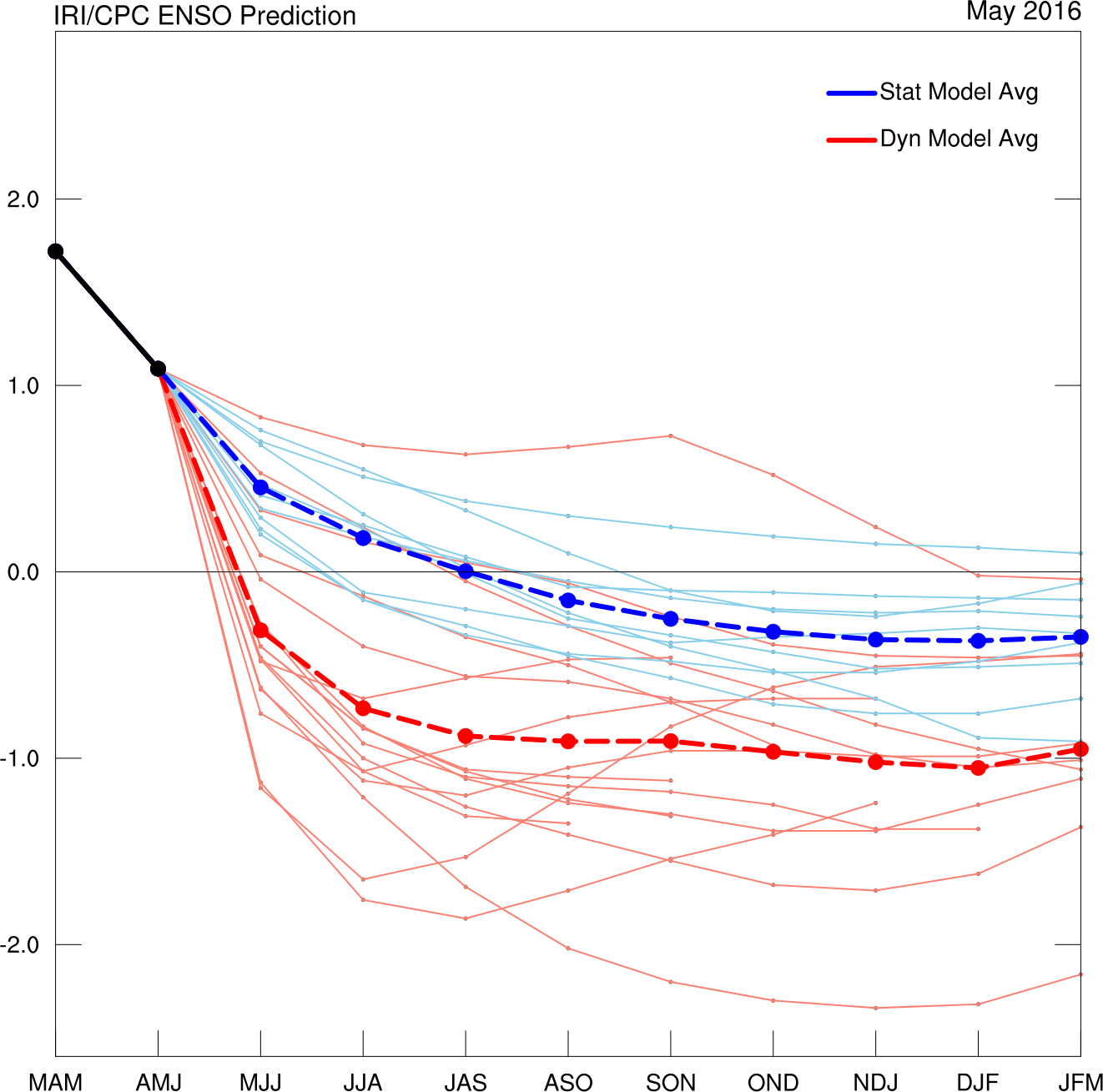
It’s interesting to compare the current dynamical (red) and statistical (blue) model predictions. The statistical models predict a return to a neutral state, while the dynamical models predict a decent La Nina.
My understanding is that it is pretty typical for statistical models to behave this way, because they don’t represent the non-linear processes that lead to strong events. So ultimately statistical models tend to just make a signal decay according to an empirical auto-correlation.
If the 97/98 El Nino is any indication of what’s to come then we should expect a strong La Nina, like the dynamical models suggest.